

Hello boys and girls,
Here’s another one for the books. Have you ever experienced designer block? I have.
Without boring you with too many details, I will try and explain how I have managed to overcome it, but spoiler alert!! the answer is EMPATHY. Some would say well duh…Of course, you have to empathize with your target audience, but it’s easier said than done most time. But let’s roll back a little bit.
In one of my previous case studies, we touched on how to create personas and essentially how to instrumentalise our findings to flesh out a workable solution, one that would solve our user’s pain points.
The part where I don’t follow my own rules
Being a designer I always try and take a step back and analyse the problem that has been given to me. But in this instance, I completely failed and here’s why.
For this exercise the brief was simple. I was to “promote the brand as a cheaper alternative to beverages sold by big brands such as Coca Cola.
Although the brand is a cheaper alternative, it should not be portrayed as inferior in quality or taste. Also, take into consideration the brand is global with branches in Africa, Europe, and the Middle East.”
To simplify it in one sentence: “Kingsley is a soft drink brand targeted to lower LSM, and the idea is to market it as a more affordable product to those of the Coca Cola company.”
The problem I needed to solve was time-sensitive. With the added pressure I went head-on to design something I thought I wanted to see.
I came to a point where I was just staring at my screen thinking of ways to enhance my designs. And that was a huge mistake.
I didn’t take the time to think of my users and what they wanted nor the type of reality they were facing… I struggled. I have to add that not being part of that market segment didn’t make things particularly easy for me. And although I subconsciously knew the answer to this problem, I didn’t want to face it. I needed realistic personas to move on (It didn’t help that I had also lost the first version of my homepage design and wanted to kick myself in the b*tt…But I also didn’t have to for that either)
I was telling someone recently that designing without a purpose is a pure waste of time. We need to figure out solutions to particular problems and that’s where we, as professionals come in.
The part about Empathy
I’m sure somewhere in our lives, or even during an argument we were told or told someone something in the flavor of “Try to walk in my shoes and understand how I feel”
The funny bit about that part especially during a heated argument is that we seldom do it. Our ego is at play and we try the find the right words and arguments to fit our narrative.
From a UX Designer’s perspective, It is something that we absolutely need to do. Whether we like it or not, our users are our answers and we have to get to their level to solve or anticipate their issues. We can only use assumptions until we get to test our theories in a user testing methodology which I will expand a little bit on further down this article.
How do I walk into my user’s shoes?
Quick answer: A lot of imagination and a little bit of coffee.
Just like a detective would have to reconstitute a murder event and approach the crime scene as if he was impersonating the murderer, a UX Designer will have to do the same.
Based on my assumptions, here were my findings. Let’s start by defining our mission, should we?

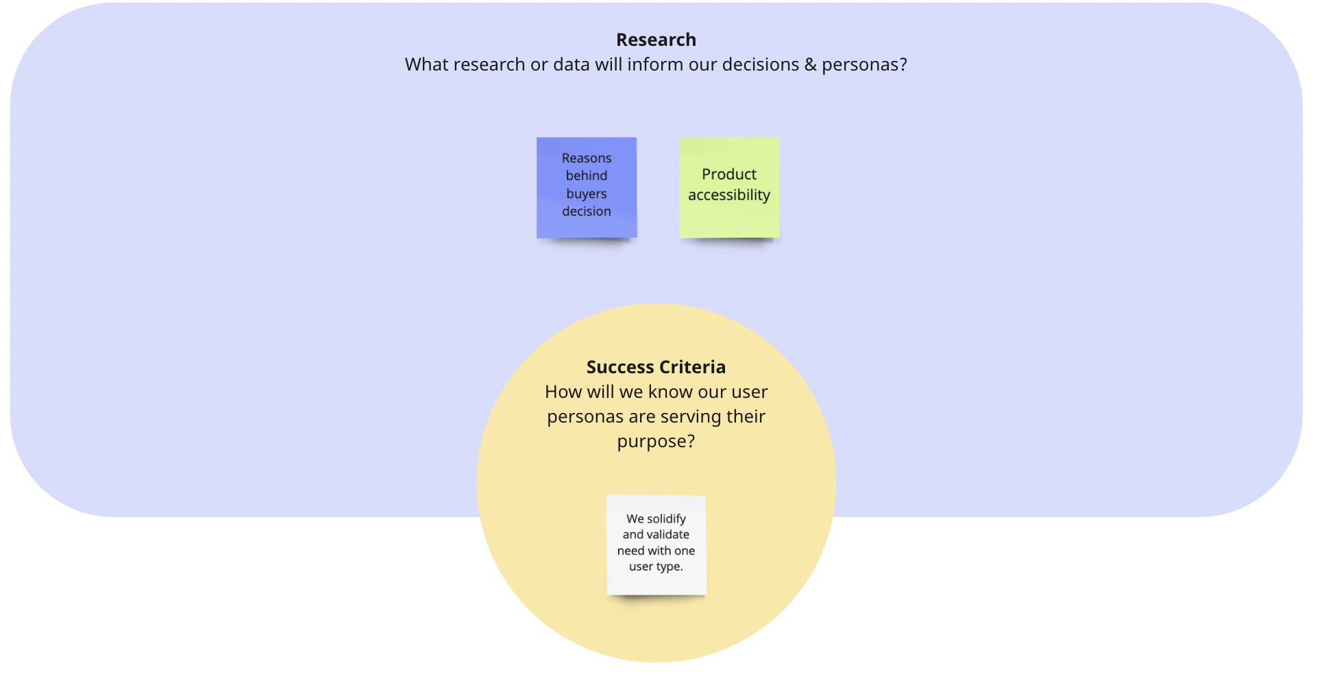
I decided to go for two distinctive profiles: A mother of 3 kids, and a construction worker.

Now that we know a little bit more about Laurent, here’s the response I came up with regarding his particular use case:

By giving our fictional persona, a name and a “soul” we can almost get into their head and understand what drives them. Doing so will eliminate a lot of thinking effort on our part. We just need to remember at all times that these are all but assumptions.
Let’s look at our second persona.


Congratulations, we have identified the key issues our users are currently facing.
The part where we ask ourselves: What now?
Let’s look at what we know.
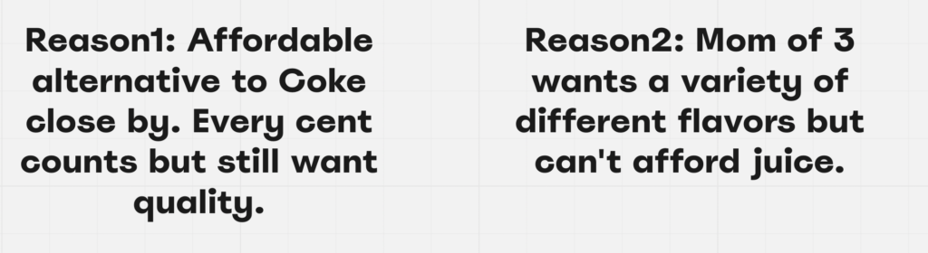
Laurent just moved to the city and is not looking to travel too far to get to a store that keeps his favorite drink. Money is tight and transport is costly. He likes the Kingsley Cola flavor and would ideally like to find a facility that sells it around him.
Carlyn is a mother of 3. She would like to give her kids a variety of different flavor drinks. Juice being expensive, Kingsley luckily has a wide variety of flavors she can choose from and keep her kids happy.
She gets most of her recommendations from friends suggestions online or verbally.
The website MVP will be fleshed out as follows:
- Being able at all times to search and locate a store.
- Making the user aware of the huge variety of different products Kingsley has to offer per category.
- Making it easy to recommend a product and facilitate the conversation around it.
The part where we get practical
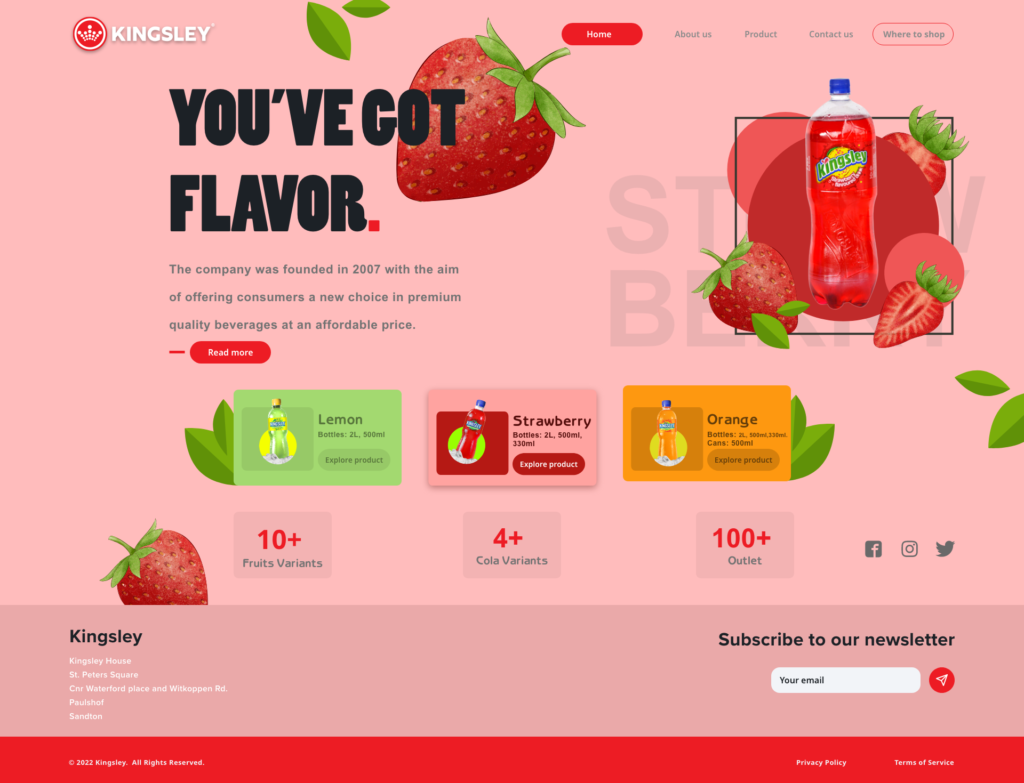
High fidelity designs
I have Carlyn in my mind and I’m thinking of her kids.
We need to highlight the different flavor options the brand has to offer. We also need to give Carlyn the ability to explore a particular product if she wishes to.
And let’s not forget Laurent. We need for him to be able to locate a store nearby from the Homepage.


Try it yourself:
https://xd.adobe.com/view/098008e6-c9ec-4b4d-9334-9f60f830d5c2-5cd3/
The homepage gives the user the ability to switch from one flavor to the other, giving the user a sense of variety.
Secondly, we also need the user to land on the page and explore any of the advertised products.
For the Product list page, the user needs to land on the page and quickly get to a product of his liking.
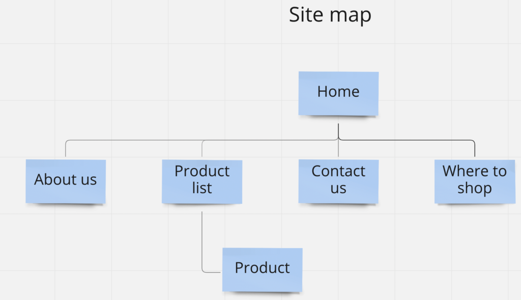
Keeping these specifics in mind, let’s put a wireframe together.
Wireframes – Product list and page

I gave the user “quick access” to a product category as well as the ability to search and filter.
I anticipate that doing so will drastically enhance the user’s navigation throughout the product page.
Now we can explore the actual product page.
We need a sharing system and as well the ability to locate a store nearby.
I came up with the below:

Finally, I just needed a nice loading page before landing on the homepage section.
A bottle filling up as the page loads seemed fitting, now it was just a matter of putting everything together.

Lets put it all together

END TO END LINK: (HIGH AND LOW RES) https://xd.adobe.com/view/5ab22616-50fb-494d-9020-dc159d752f1f-0fe1/
The part about User testing scenarios
In the past few articles I know I have been bashing your ears about assumptions, it is incredibly helpful especially when creating a product from dust. One of the most valuable aspects of the product life cycle is validating our assumptions, and the only way to get to the truth is to test our approach and put our product in the hands of actual users.
We need to remember that it is of the utmost importance to address the right target audience, failing to do so may result in you collecting dirty data. So the right user needs to be approached to gain some qualitative insights.
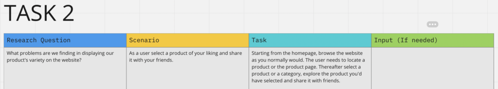
We will detail in another article how to conduct valuable usability testing techniques. For the time being let’s look at the type of scenarios, we would most likely conduct along with our intended audience.
The idea here is to give a user a test to conduct, using our interface. And through the user’s evolution/behavior, we will then record our findings and measure our success rate versus failure.
Doing this will give us some valuable insight into the user’s mind and how accessible our product is. It is truly baffling the number of findings you’d get out of conducting a usability testing scenario.
Here’s my approach and how I would have approached testing out my product:
Scenario 1:

Scenario 2:
Here’s a few extra elements for your eyes only.

Thank you if you’ve made it this far.
See you soon for another case study, and stay safe.
Francis Manga.
“Designers will save the world”