
Let’s create a weather app.
This article aims to give you a basic understanding of what User experience is and what to expect when solving a particular problem.
Because being practical is a lot better than beautiful words put together, let’s look at building an app from a basic research level, up until the final product.
For this exercise we are going to create a weather app with the following requirements in mind:
1. Identify and detail 2 user profiles (UX) – [Minimal Details]
2. Identify and detail 2 user testing scenarios (UX)
3. List /present /moodboard references to your design. Source your inspiration (UI)
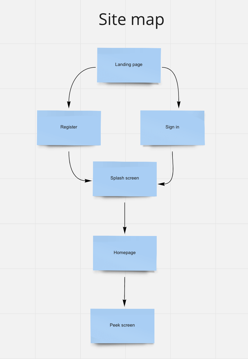
4. Simple sitemap of your app design (UX)
5. Low Fidelity Wireframe of a minimum of 3 screens of the app (home page plus any 2 screens) (UX/UI)
6. Design of minimum of 2 High Fidelity screens of the app (UX/UI)
What will be described here, would hopefully serve as a guideline, should you need to build or solve a particular UX/UI problem and do not know where to start.
What makes UX exciting and necessary is the capability to solve any given problem by answering and addressing a particular need or set of needs.
I’m sure you never thought of what a typical user would need from a weather app besides, well, just checking the weather. But the second you start digging in a little bit more, you realize there’s a little more than what meets the eye.
The first approach to any given UX problem is empathy. Empathize with the user to understand his pain points. What is it that frustrates him and prevents him from achieving a particular goal? With this in mind, you can already start drafting a semblance of a solution. But first thing first, you need to identify your target user. Let’s have a look below.
1 – Identify and detail 2 user profiles: How do I create a persona?
A persona is a fictional user made from assumption. Your character needs to fall within what you have agreed could be a potential user from the App you will be creating. In this particular case let’s look at what potential users could look like for the weather App we need to design.
1.a – Miro, Miro, who’s the fairest of them all
My favorite tool when it comes to building user flows and persona is Miro. To quote them, Miro is an “online collaborative whiteboarding platform that enables distributed teams to work effectively together, from brainstorming with digital sticky notes to planning and managing agile workflows.”
The second step is to think about what potential users would look like and their reasons for even using a weather app in the first place.
I have created 2 personas each with its own set of motivation and goals.
Persona 1:

Persona 2:

As illustrated above, the “GOAL” is the problem you would try to solve.
Keep in mind that often what seems like a simple problem, could develop into an extremely elaborated solving technique approach, in the product development cycle.
Now that we have the problem(s) down. We can start thinking of a way to answer our user’s needs.
What do we know?
- We know our users want instant access to the weather
- We know they should be able to view the weather from any given city around the globe without too much hassle.
What could be a potential solution?
- Give the user the capacity to add their favorite cities from the home screen.
- Give the user the capacity to view the weather from any given city of their choice, at a glance from the home screen.
- Reduce to the minimum the number of clicks needed to reach a particular goal.
A rough sketch could potentially look like this. At this stage, you need to pin down your MVP (minimum viable product).
2 – Low Fidelity Wireframe of a minimum of 3 screens of the app (home page plus any 2 screens) (UX/UI)
I always go by the idea that the more effort you put into your wireframe, the less effort you have to cater for in your High res designs. Chances are you will only have very minimal adjustments to make when putting together your high-resolution design.
A wireframe is also a good place to explore your different concepts. I went through a few iterations of my own using my “what I know” in order to explore “potential solutions”
At this stage, I am leaving Miro for my designing tool of choice: Adobe XD.
I could spend hours arguing how and why XD is the best tool around, how it integrates so well with other solutions such as Illustrator or photoshop, how Its prototyping capabilities are far more superior to everything else that’s currently in the market….But I’m not going to do that. I will just say it makes me happy.
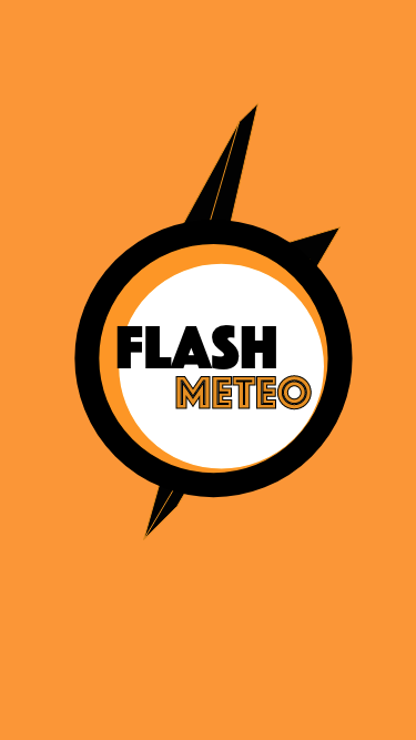
Give your app a fictional name. It will make your life easier when designing a splash screen for it. It also gives your app an identity and a character, even if It’s just a temporary name.
I’m going to call this app “Flash Meteo”. Flash because “fast”, flash because “thunder”…You get the idea. Meteo is another word for the weather.
We can start brainstorming.
The first iterations are never pretty and at this stage, it is not the point. You want you lay down the foundation that will help you frame your thinking better.
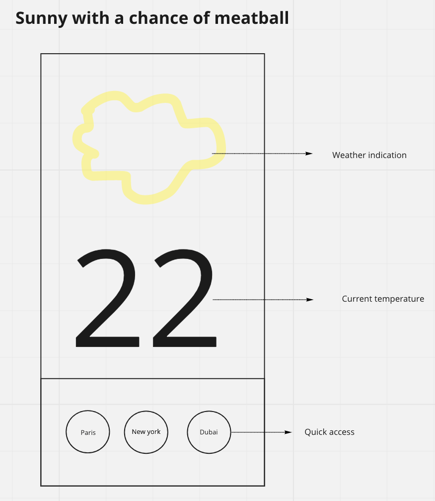
As a reference to my very early concept, I have my favorite cities added at the bottom of the page, I also have the weather from the town or city I’m currently at, as well as the weather for the upcoming days.
I feel like I’m heading in the right direction but something is still missing. I do not know exactly what It is, so I go back to my mental model and try to put myself in one of my persona’s shoes. Doing so helped me acknowledge that I needed quick and instant access to information. I had to find a way to address it.
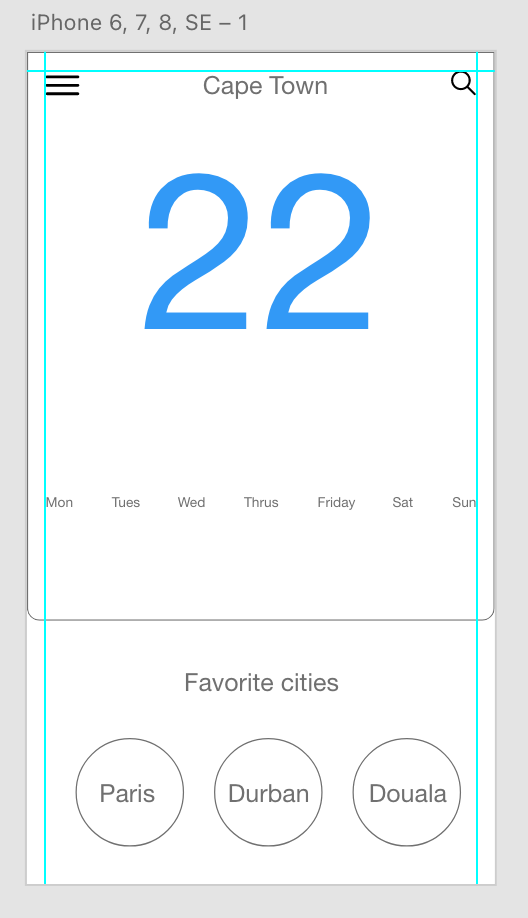
1st attempt:
Something about this layout doesn’t feel right. Yes, now I can toggle through my favorite cities and have the information displayed inside the block on the right side but even though It’s practical, It just doesn’t feel appealing to me. So I’m reverting to my original layout. As they say, your first ideas are always the best, and no idea is ever wasted. My takeaway from this aborted layout is that I want a peeking system. Being able to peek effortlessly; toggle from one city to the next without much effort. I’m feeling more confident now.
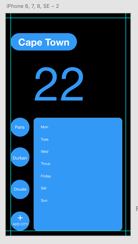
2nd attempt:
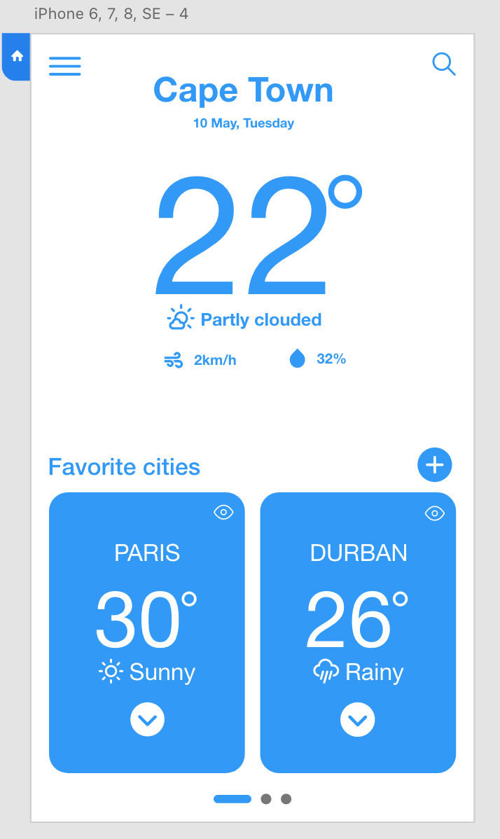
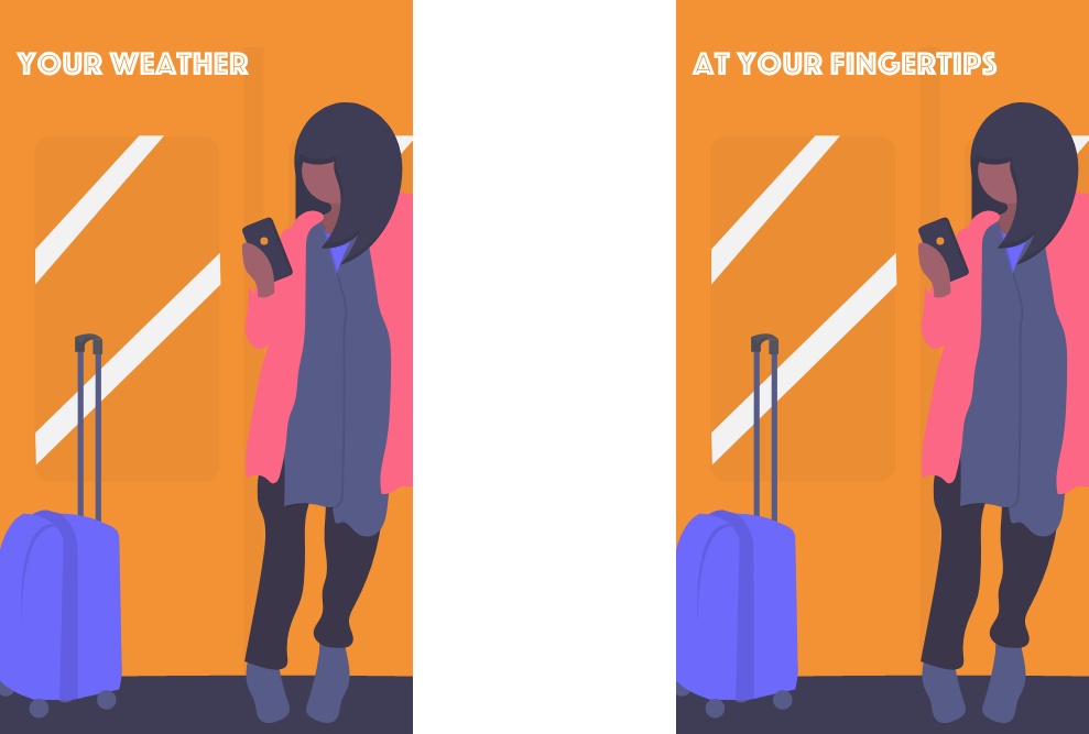
There are 2 new additions to my little blocks at the bottom. A scrolling system going from right to left. I want to keep it to 3 pages max and give the user the ability to add 2 cities per screen, which means 6 in total. The user would later choose to delete and replace the block with any city in the world.
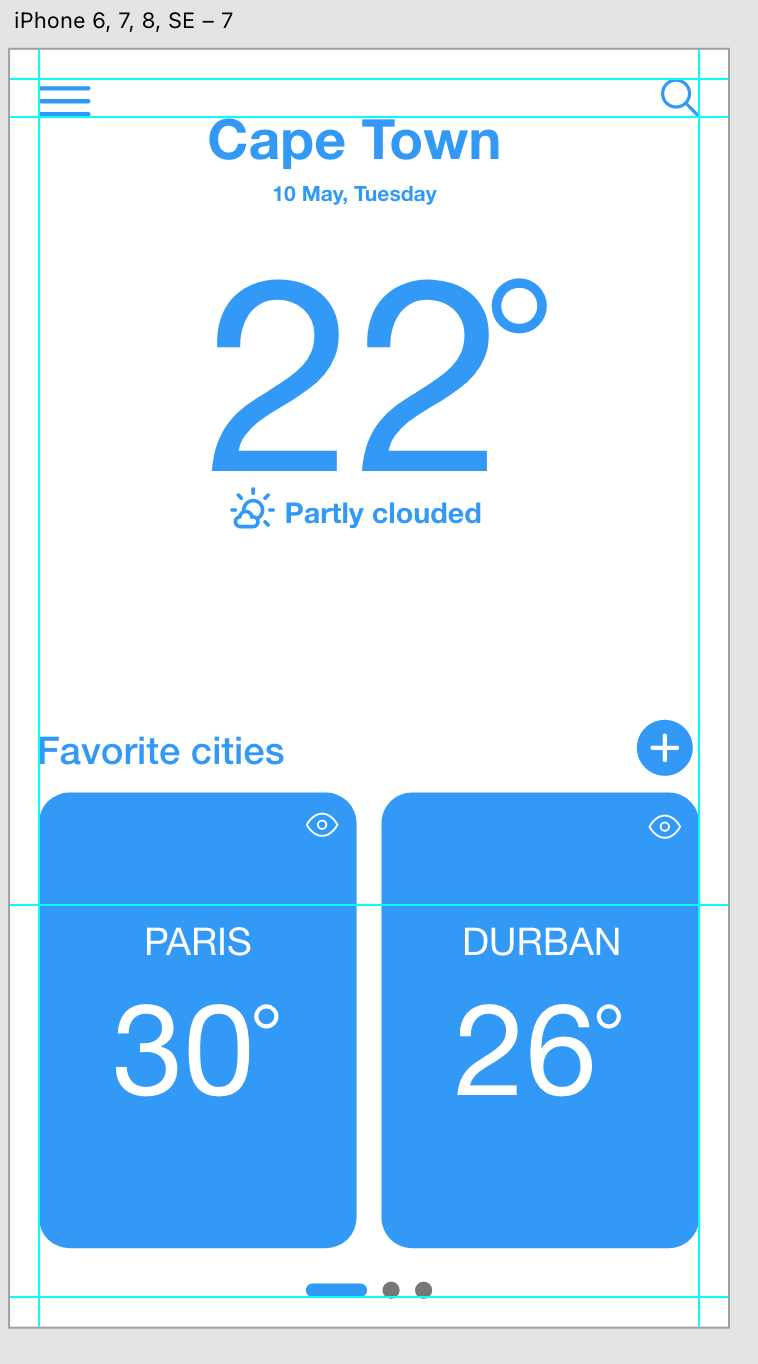
The other addition is the eye. Our “peeking” system. Upon clicking the eye icon you will unfold the block into a bigger version of the same block with a lot more details pertaining to a particular city. Let’s take the Paris block as an example. I can see it’s 30 degrees in Paris. When pressing the eye icon, I will have more details for the days to come. The block however still feels a little frail in terms of information. I feel like it should give us a lot more than just the weather for the day at the time.
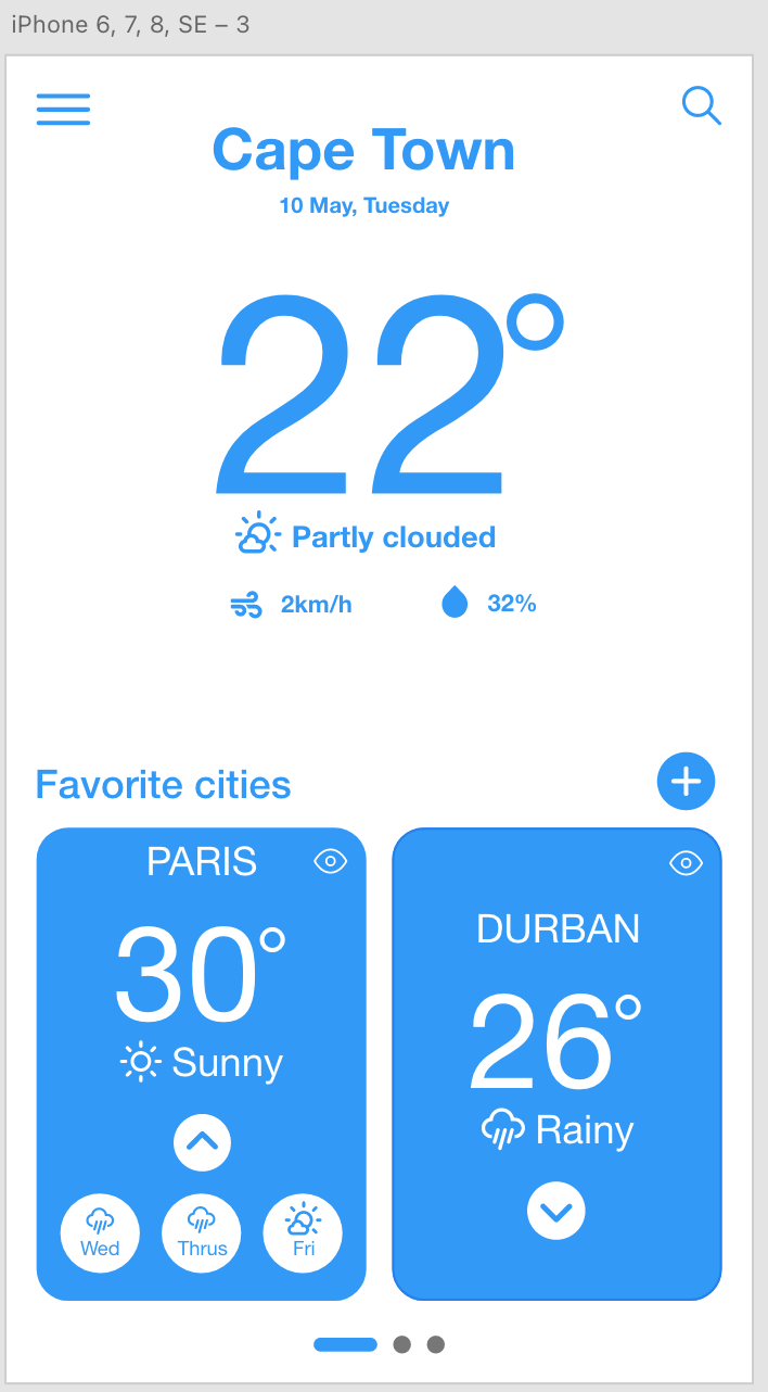
3rd attempt:
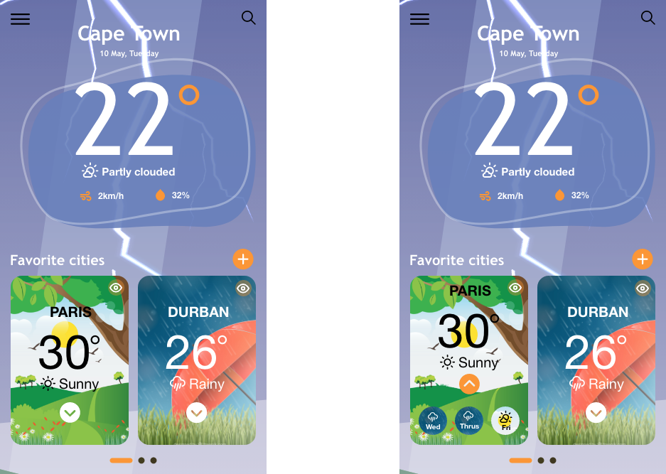
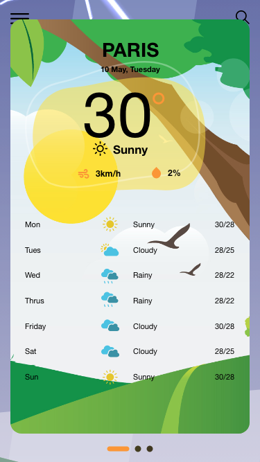
Ok, now the blocks are a lot more informative. We know more about the weather conditions in Paris, not just from a temperature perspective but also the weather condition. We have also added a dropdown button which should give us more information regarding the next three days.
Not too shabby. Now let’s work on the peeking system we’ve been mentioning earlier. It is about time we give it the attention it needs.
First of all, let’s design the screen. The idea is to bring the information to us without having to leave the main page. Let’s also remember that, we want that access and functionality to be as quick as possible.
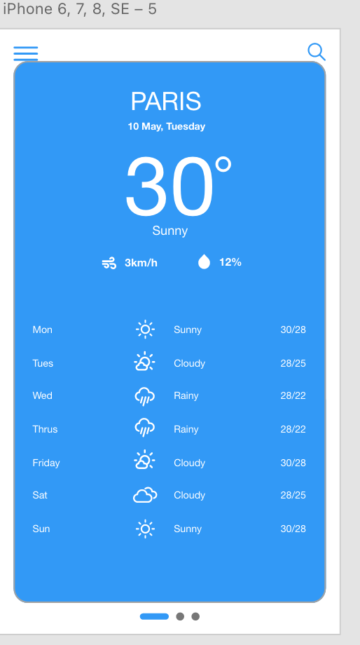
Our peeking system wireframe is complete. We have our big beautiful block that overlaps the main screen with all the pertinent details from the days to come.
Let’s see it in action. We are going to make one of our favorite cities a component and add a toggle state functionality to the component. Doing so will guarantee a smooth transition between the normal component state and the toggle state. Here is it in action:
Try it yourself: Wireframe – toggle state (adobe.com)
3. Design of minimum of 2 High Fidelity screens of the app (UX/UI)
How about we go the extra mile and design a logo for this exercise?

It looks decent enough and will go well with our upcoming splash screen.
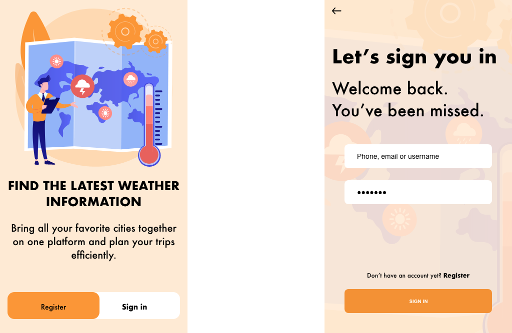
Let’s add two more screens introducing the app, before actually landing on the landing page.
The page will serve as an introduction to the app.
Now, let’s design our high-resolution screens from the wireframes we have carefully created.
It should go relatively well since we already have our MVP down as well as our functionality.
Let’s have a look below:
And of course, we shouldn’t forget our toggle state screen.
Try it yourself: Toggle State Hig Res (adobe.com)
Last but not least, let’s create a login page for your App. A login feature is essential should you wish to carry your experience across your different devices.
The login page is also a nice way to introduce the app’s features and promise.
Let’s put one together.
Now that we have all of our screens we should probably bring everything together and have a first concrete look at our future app.
End to end (adobe.com)
3. Sitemap and moodboard
To wrap things up this is what our sitemap would look like.
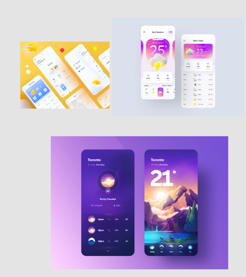
moodboard
Thank you if you made it to the end of this article. Looking forward to the next case study.
Stay safe.
Francis M.
“Designers will save the world”